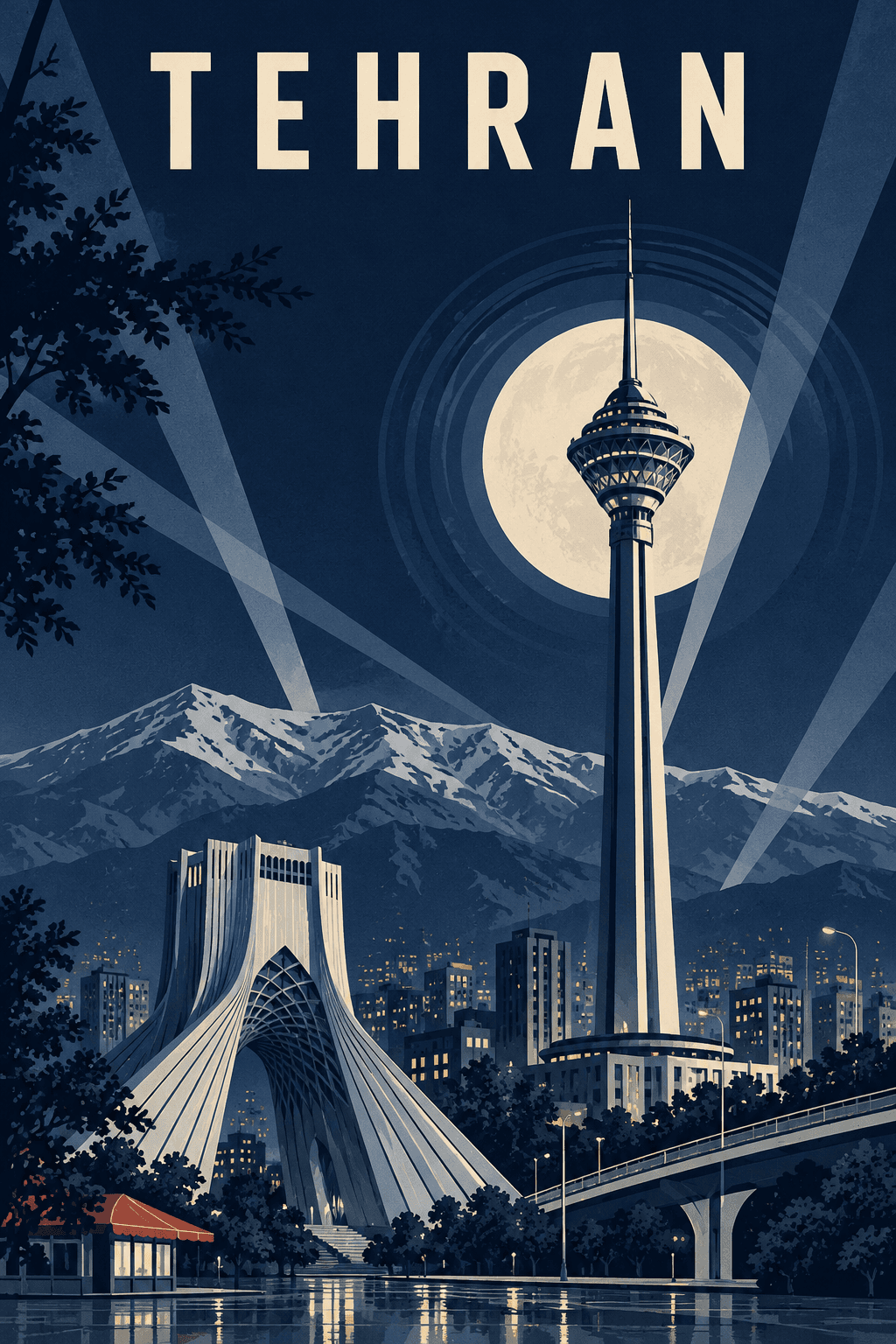
 نمونه خروجی
پوستر شهر ها
طراحی پوستر شبانه شهر مورد نظر با رنگهای سرد و حالوهوای سینمایی.
متن پرامپت
ENCITY: [CITY NAME] Create a dramatic vertical 2:3 travel poster of the specified city at night, as part of a consistent collectible Art Deco poster series. AUTOMATIC CITY ADAPTATION Identify the city and select its most recognizable real architectural landmark as the main protagonist. Choose two or three authentic secondary elements from its architecture, urban landscape, vegetation and geography. Use only landmarks genuinely associated with this city. Do not borrow buildings from other destinations or invent hybrid architecture. If several cities share this name, prioritize the Iranian city. Automatically render the city’s conventional English name in uppercase as the poster’s only text. Do not print the placeholder or any instructions. CORE PRINCIPLE 70% recognizable architecture + 30% Art Deco stylisation. The viewer should recognize the city before noticing the graphic style. Preserve the main landmark’s real silhouette, essential proportions, structural openings, roof shape and defining architectural features. Simplify decoration, never structure. Do not turn every landmark into a tower or add domes and minarets where they do not exist. COMPOSITION A monumental low three-quarter viewpoint looking upward at the main landmark. Preserve its natural proportions: broad buildings remain broad; slender towers remain slender. Keep the defining silhouette readable and avoid cropping essential features. Build a strong diagonal from lower left to upper right using locally appropriate streets, terraces, paving, bridges, rooflines or garden paths. The main landmark dominates the middle and lower frame. Secondary landmarks remain smaller and clearly separated. A compressed artistic panorama is acceptable, but do not fuse separate landmarks into one building. Reserve the upper third primarily for the destination name, night sky and moon. Use generous negative space and a clear visual hierarchy. LOCAL IDENTITY Adapt the foreground and background to the actual city. Include mountains, water, gardens, windcatchers, bridges or distinctive trees only when appropriate. Do not automatically add rivers, reflecting pools, snowy mountains, desert dunes or palm trees to every destination. Avoid generic regional stereotypes. NIGHT ART DECO LANGUAGE 1930s luxury sleeper-train and ocean-liner travel advertising. Streamline moderne, bold architectural geometry, precise arcs, deliberate edges and restrained parallel line rhythms. A large pale moon sits behind and slightly beside the main landmark. A few concentric stepped rings radiate from the moon, partially hidden by the architecture. Two or three pale, straight searchlight wedges cross the sky. These graphic elements must remain subordinate to the landmark. Moonlight defines one side of each structure as a flat pale-blue plane. The opposite side becomes a clean near-black navy shadow. Use sharp boundaries and strong value contrast. No soft shading, luminous outlines or atmospheric glow. COLOUR SYSTEM Approximately eight to ten flat, slightly desaturated colours: midnight navy, ultramarine, mineral blue, pale moon blue, silver grey, cool stone grey, grey-lilac, near-black navy, pale cream and one tiny muted coral accent. The entire image must feel cold and nocturnal. Translate warm stone, brick and adobe into cool moonlit grey-blue planes while preserving material-defining details. Pale cream is reserved for the moon and tiny window lights. Use muted coral only on one very small foreground detail, such as a café awning. No large warm areas. Solid, unmodulated ink colours. No gradients except subtle stepped bands near the horizon. TYPOGRAPHY At the upper centre, display only the city’s English name in uppercase. Exact conventional spelling. Wide letter spacing, slightly condensed architectural geometric sans-serif. Single solid pale colour, strong readability, generous margins. No slogans, subtitles, Persian text, labels, signatures or other lettering. Keep architecture and tree branches clear of the title. PRINT SURFACE Crisp flat printed ink on clean paper. Very faint even printing grain and subtle ink-density variation. Contemporary museum-quality finish. No yellowed paper, vintage stains, distressed edges or artificial damage. FINAL MOOD Nocturnal, monumental, hushed, theatrical, cold, elegant and collectible. Maintain the same palette, typography, lighting and print treatment across different cities while giving each city its own authentic composition. NEGATIVE CONSTRAINTS No extra text, logos or watermark. No yellow, mustard, ochre, gold, amber or orange sky. No sunset, daylight or overall warm cast. No photorealism, 3D rendering, airbrush, neon, lens flare or glowing halos. No scattered decorative stars. No sepia, fake paper aging, stains, tears or distressing. No cartoon styling or travel-sticker aesthetics. No invented landmarks, duplicated monuments or structurally distorted architecture. OUTPUT Generate one finished vertical poster, not a mockup, collage, framed wall display or presentation sheet.
این تصویر با همین پرامپت ساخته شده؛ خروجی نهایی بسته به مدل هوش مصنوعی و عکس شما ممکن است کمی متفاوت باشد.